Paris 2024 Olympics Identity – French Finesse Falls Flat
Is it a woman? Is it Tinder? Is it Marilyn Monroe? No, it’s the Paris Olympics logo!
The Paris 2024 Games’ visual identity has sparked quite a debate. Is it a celebration of French culture, or a chaotic mess? We break down the design’s good, bad, and ugly, from the iconic logo to the controversial mascots.
By Mandira for Red Bangle
08 min read
Jul 24, 2024
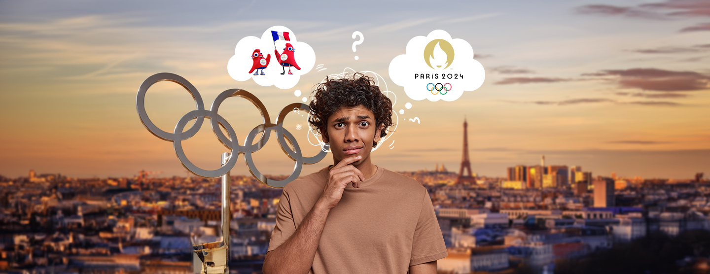
The world went nuts when the Paris Olympic Games 2024 visual identity debuted on the gigantic screen of Le Grand Rex. In mere seconds, the logo stormed the internet with divided opinions among the graphic design community and the French. Do we love it? Do we hate it? The idea was there, the concept was strong, and France’s rich history offers a wealth of inspiration for great design. But could it have been better?
The logo fuses 2 iconic symbols of the games – the gold medal and the Olympic torch – with an image of Marianne, the embodiment of the French Republic, representing the values of ‘Liberty, Equality, Fraternity’.
The logo attempted a triple axle but fell flat. The internet didn’t shy away from making the most ruthless (read: hilarious) comparisons of the logo. From comparing it to the infamous haircuts of Salman Khan’s Radhe Bhaiyya and Ashley Green’s Alice Cullen to Tinder’s flame logo – it’s been painfully dissected in the court of public opinion.
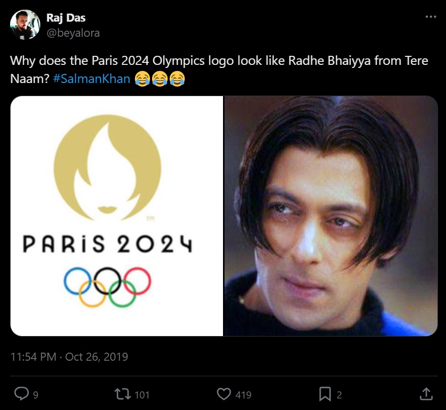
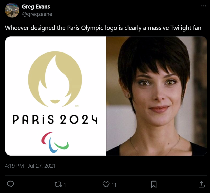
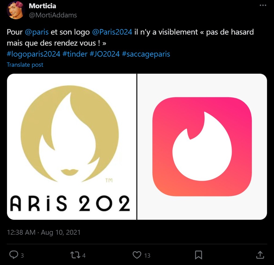
But the logo does hit many historical milestones. It’s the first Olympic emblem common to both the Paralympic and Olympic Games, differentiated only by the rings at the bottom. Marianne is a powerful tribute to the games’ history when women athletes first competed in the 1900s Paris Olympics. Marianne also represents the ‘revolutionary spirit’ of the Games and signifies that it ‘belongs to the people’.
Read on to find out the good, the bad, and the ugly of the Paris 2024 Olympics’ visual identity.
The Good: Art Deco Elegance & the Magnificent Medals
Parisian flair meets athletic spirit – that was the idea for the visual identity for the Paris 2024 look of the games – for it to embody the city’s style. And it does quite a few things right.
Inspired by the French creative spirit and the Art Deco movement, this look celebrates timeless elegance. The stylized Paris 2024 typeface embodies sophistication. The rich color palette of blue, purple, gold, and pink conjures up feelings of happiness and celebration – much in line with what watching the Olympic games feels like. The lines and patterns derived from the iconic French architecture beautifully bridge the past and present.
Julie Matikhine, Paris 2024’s brand director, perfectly captures this sentiment: “We are Paris, we are French, and we are the country of fashion and culture, so we don’t want it to be a rainbow of colors. The colors are happy, inviting, optimistic, and celebrate the joy that is the Games.”
The identity is tied together with the phrase ‘Sous les pavés, les Jeux’ (Under the paving stones, the Games), a play on the famous protest slogan ‘Sous les pavés, la plage!’ (Under the cobblestones, the beach!) from France’s 1968 protests. Matikhine explains, “These paving stones are the basis of our system. A paving stone is a square, and using this simple shape we can build lots of things. But what’s interesting is what we put in the paving stone shape.”
Each of these squares has one of 3 elements: popular architecture from the host city, like the Eiffel Tower, Luxor Obelisk at la Concorde, etc; the French art de vivre; and the sports venue such as Stade De France, Parc De Princes, etc. The overall visual identity with its graphic shapes pays homage to the Art Deco style seen during the 1924 Olympics, which was also held in Paris.
Yet, despite the thoughtful concept and the rich cultural context embedded in the design, the execution of the Paris 2024 Games falls short. It lacks the cohesion and impact needed to truly resonate as a memorable brand identity.
The stroke of design brilliance though, lies in the medals. For the Paris 2024 Games, each Olympic and Paralympic medal contains a piece of original iron from the iconic Eiffel Tower, creating a tangible connection to the heart of Paris. It’s a result of collaboration with the renowned LVMH jeweler, Chaumet, ensuring that each medal is a masterpiece of craftsmanship. The design draws inspiration from three key elements: the hexagon, radiance, and gem setting. Together, these influences converge to create medals that are not just mere medals but breathtaking pieces of art, embodying the spirit and elegance of Paris.
While the medals effectively embody the essence of France — its rich history, culture, passions, and grit—the Look of the Games falls disappointingly short. With the initial promise and a lovely underlying concept, the execution comes across as amateurish, failing to reflect the sophistication and elegance that one would expect from such a prestigious event.
The Bad: Good Ideas + Bad Execution + Cryptic Designs
When talking about the ‘bad’, the botched logo and convoluted pictograms come to mind.
If you want to see design sophistication at its lowest, the lowercase ‘i’ in the typeface does a good job of that. The logo, despite its symbolic depth, fails in its execution. Using Marianne to pay homage to the French Revolution as well as an ode to the women athletes was a brilliant move. However, the Goddess of Liberty was reduced to a Karen haircut with bad lip work in its design execution.
The pictograms, on the other hand, fail to meet the high standards of the Olympic icons. Paris 2024 made a bold move by not featuring figures in their pictograms. Instead, each one comprises three graphical elements: an axis of symmetry, a depiction of the ground, and a representation of the sport. However, they are so cryptic that perhaps only Dan Brown’s fictional iconology and symbology professor Robert Langdon could decode them. Generally, pictograms are meant to be universal and functional. And for Paris 2024’s it was also meant to be inclusive (again, good idea, poor execution). Intended to be striking coats of arms or ‘badges of honor’, it is artistically appealing. But its complexity makes it hard to decipher, even for those with an educated designer’s eye.
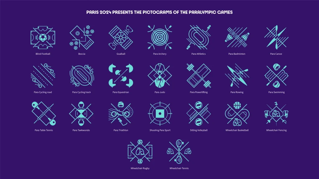
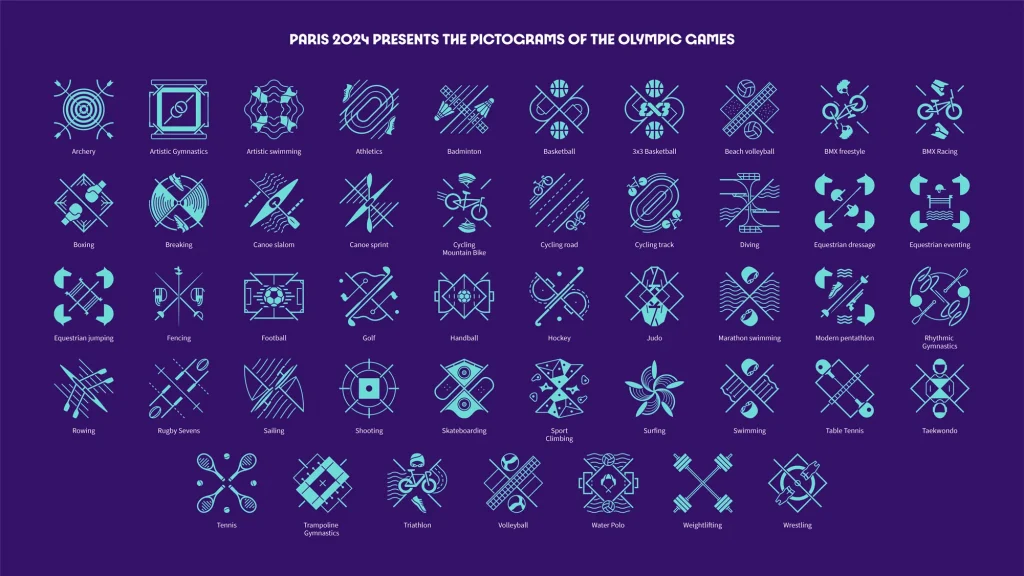
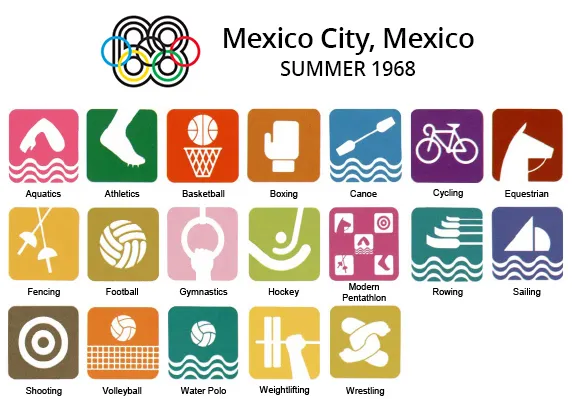
For comparison, consider the Mexico City 1968 pictograms, which, albeit using parts of athletes’ bodies or equipment, conveyed the sport clearly while maintaining simplicity and readability.
The Ugly: Controversial Mascots
“Paris 2024 presents the Phryges!”
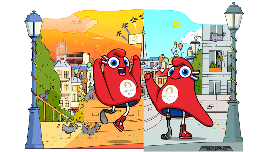
The mascots, the Phryges (pronounced “fri-jee-uhs”), have arguably attracted the most controversy. The Phrygian cap isn’t average headwear. It is a symbol of the French Republic, revolution, and freedom. This cap was worn by French revolutionaries to signify liberty during the French Revolution. You can also find the French Revolution icon Marianne adorning this cap, setting in stone the powerful symbolism that has become a French national staple.
The Phryges mascots come in a set of two. The Olympic Phryge is a caricature of the hat in the French national colors of red, blue, and white, with big bold eyes and a ribbon cockade. The Paralympic Phryge has the same look but includes a prosthetic leg.
“Rather than an animal, our mascots represent an ideal. Since it is familiar to us and appears on our stamps and the pediments of our town halls, it also represents French identity and spirit.” said the Paris 2024 President Tony Estanguet.
While the symbolism is powerful and in line with the overarching ideology and visual identity of Paris 2024, it has been widely compared to the clitoris. This comparison has led to jokes and memes, with some viewing the design as inappropriate for the Olympic Games. Some have praised this as a bold, feminist move, others find it distracting and off-putting.
The Paris 2024 Olympics identity is truly a blend of good, bad, and ugly elements. The Art Deco style and unifying logo reflect a rich cultural heritage and a progressive vision. But one can’t look past the execution missteps with the logo and the complexity of the pictograms. The mascots, despite their historical symbolism, fail to provide powerful imagery that resonates with the public at large.
As we move closer to the Games, the impact of these design choices will become clearer. Will they inspire and unite, or will they distract and divide? Only time will tell. In the meantime, the Paris 2024 Olympics identity remains a bold statement, a conversation starter, and a testament to the enduring power of design to evoke strong emotions and reactions.